What are diacritics and special characters?
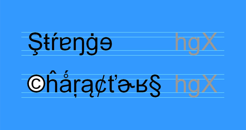
Diacritics are those fiddly little dots, dashes, hooks, and slashes with which foreigners and show-off literary types ornament their letters. Some diacritics alter the pronunciation of a letter, others form entirely new letters to bulk up alien alphabets.
Special characters is a catch-all term for the hundreds of non-alphanumeric glyphs, symbols, and pictograms that add a touch of humour or sophistication to a lacklustre piece of writing. Or the flash of tinsel that makes it even worse.
But where do you find these characters? And how do you know which to use, and when? This is the guide that helps copywriters, designers, and marketers drop in the characters that give their message a look of supreme professionalism.
Don’t look here for a complete list – that would be a massive technical undertaking. This is something more practical: an introduction to the variety of characters, supported by links to pages prepared by people who have already done the hard work of sorting them into relevant and usable lists.
Yes, MS Word does have its own insert-character option, but those 3,360 unnamed characters are in unhelpful Unicode order. The lists on this page are easier to navigate.
Diacritics, accents, and non-Latin letters
Does it matter if you get your daily shot of caffeine from a cafe or a café? Not really. Either spelling is fine. But things are different when you’re dealing with proper nouns or quoting a string of foreign text. Spelling someone’s name exactly as the owner would spell it is a mark of respect. It’s also a neat way of telling the world that you pay attention to detail. Conscientious writers get their diacritics spot-on.
BRANDS:
Caffè Nero, Hermès, Häagen-Dasz
NAMES:
Katrín Jakobsdóttir (Prime Minister of Iceland), Recep Tayyip Erdoğan (President of Turkey), Maroš Šefčovič (Slovak member of the European Commission)
If you prefer to call them accents, that’s fine. Accents relate to pronunciation; diacritics relate to type. And not all diacritics change the sound of a letter. In Danish, for example, a slashed ø is a different letter to an ordinary o (sounds different too).
To complicate things even further, many alphabets have additional, non-Latin letters. The Icelandic eth (ð) and thorn (þ) are two examples. Many more use their own scripts. Luckily there are Latinised versions for Western consumption, which is why you can tap out Vladimir Putin’s name on any keyboard.
If you do need to quote a word or two in its original Greek or Cyrillic, cut and paste from a trusted source. Which is exactly what I did to spell out Vladimir Putin in his native Cyrillic: Владимир Путин.
Table of diacritics and non-Latin letters
The table below covers most of the diacritics and non-Latin letters you’re likely to encounter. Note that there’s only one lowercase example for each diacritic or stacked pair of diacritics. In everyday use you’re unlikely to need anything other than the basic diacritics in rows 1 and 2, and the handful of non-Latin letters in row 5.
Click the table to enlarge.

Find your diacritic or non-Latin letter
Knowing the name of your diacritic or non-Latin letter often makes it easier to find the combination of letter and diacritic you need in the tables below.
- Alphabetical list of letters with diacritics (1) – alt-codes: The alt-code list from Font Meme is extraordinarily helpful. It’s not exhaustive, but still pretty good – 23 entries for the letter A, for example, doubled up to 46 to take account of uppercase and lowercase letters. Includes Mac shortcuts.
- Alphabetical list of letters with diacritics (2) – Unicodes: Pinyin’s Unicode list is even bigger and includes non-Latin letters. Between these two lists, you’ll find just about every character you’ll ever need.
- Add extra characters to your keyboard: TypeIt takes a different approach. Choose your language and start typing online. For each of its two dozen languages, TypeIt gives you an extra online keyboard containing the additional letters you need for that language. When you’re done, cut and paste into Word.
- Give yourself a global keyboard: Lexilogos does much the same thing as TypeIt. Positives: it has a massive list of languages together with a few notes on usage; negatives: each language seems to have fewer characters than TypeIt.
- Scroll-through list of letters: With big bright characters, the listing from Toptal is the most visually appealing. Since it’s in Unicode order, you have to scroll through row after row of them to find the one you want. Click any character to get a large image.
- Everything you need to know about diacritics: This Wikipedia page is a typographer’s delight. It talks you through the diacritics and their use, language by language. There’s even an entry for Manx.
- Designing diacritics: OK, a bit tangential to the needs of copywriters, but David Březina (proud owner of an r-caron and guest blogger for I Love Typography) makes such a good case for thoughtful design, it’s worth giving him a mention.
- Using diacritics in English: Another useful Wikipedia page to help you decide when to include diacritics in English words and foreign loanwords.
- Greek alphabet: RapidTables has a handy list with Unicode and alt-codes.
- Cyrillic alphabet (1): Omniglot’s page gives you two sets – early and current Cyrillic alphabets – with plenty of other useful information.
- Cyrillic alphabet (2): Easy Wikipedia list with Unicodes.
Maths, science, and logic
If you’re heavily into maths, it’s worth investing in a mathematical typeface. For the rest of us, the symbols in the Unicode character set are more than enough for the occasional equation or foray into science or logic.
Do neater sums and display smarter formulas
While your keyboard’s + and = symbols are perfect for simple sums, the hyphen and the x (or X) are awkward symbols for subtraction and multiplication. A minus sign (alt-8722) is not the same as a hyphen (− vs -), while a multiplication sign (alt-0215) is a long way from a lowercase x (× vs x).
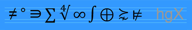
When you get to more complicated stuff – sets, logarithms, and integrals, for example – you need to know what you’re doing, or your maths will look dodgier than an MP’s expense claims.
Science is more straightforward because most SI units (Système International d’Unités) are made up of ordinary keyboard letters (m, kg, W, Hz etc). Even so, a couple of them (Ω [alt-8486], μg [alt-230 + g], and Å [alt-143]) still need a bit of research (the ångström unit, by the way, is not part of the SI system). Even that little circle (alt-0176) in °C and °F involves a typographical hunt.
For logic symbols (¬ ∨ ⊕ ∃ ⊨ etc … no, I’ve no idea what they mean either), you need special characters every time.
Find your maths and science symbols
- Simple, basic maths list: Keynote Support covers most bases with this clear alt-code list. Includes currencies as well.
- SI units for beginners (1): (Encyclopædia) Britannica’s SI listing includes plenty of helpful explanations and background information.
- SI units for beginners (2): The Physics Hypertextbook is a smarter version with a good deal of additional information.
- SI units for enthusiasts (1): Brilliant pdf brochure from the National Institute of Standards and Technology listing all possible units with tips on display. American spellings unfortunately.
- SI units for enthusiasts (2): A comprehensive European explanation in pdf form from the Bureau des Poids et Mesures.
- Logic symbols: Wikipedia has a neat list of symbols with alt-codes, Unicode, and explanations. Or cut and paste.
- Scroll-through maths and science symbols: As always, a page of Toptal characters takes some beating. It’s just such hard work to find the maths or logic symbol you want.
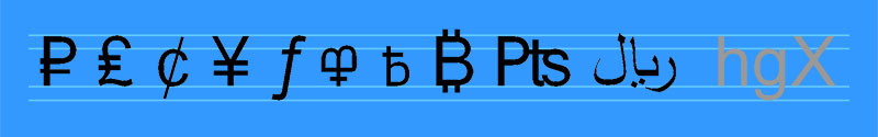
Currencies
There’s an easy way to avoid currency symbols. IBAN (International Bank Account Number) gives every currency a unique three-letter code (pound sterling: GBP, Singapore dollar: SGD, Kuwaiti dinar: KWD). The IBAN codes are what the banks use to whisk laundered money around the world.
Find your currency symbols
If you prefer to write Kč (not CZK) for the Czech koruna or ₩ (not KRW) for the South Korean won, here’s where to go.
- Currencies in alt-code order: The list from AltCodeUnicode.com would be excellent if it was in a useful order. To find the list, scroll down the left-hand menu ‘ALT Codes for Popular Symbol Sets’ till you see ‘Currency Symbols’. Shows alt-codes and Unicode.
- Alphabetical currency list: The list from XE is much better, except that the symbols are images. Many have cut-and-paste characters, but not all; all have alt-codes and Unicode.
- Scroll-through currency list: For the symbols you can’t get from XE, go to Toptal and work your way down the list till you find the one you want.
- IBAN three-letter codes: The easy way out – and more comprehensive than the XE list.
Phonetics
How do you help someone pronounce phonetics? Do you write fuh-neh-tix or some other near-ish soundalike (fur-net-icks anyone?), or would you offer them something a shade more technical: fəˈnɛtɪks?
The last option uses nine of the 180 (roughly) symbols approved by the International Phonetic Association. The IPA pronunciation is precise because each of those odd characters represents a defined sound. Which is fine if you’re familiar with the IPA scheme or have a code book to hand.
The point is that phonetic symbols are purely for technical use with readers who know their sounds. For everything else, you’re better off making up your own sounds-like-X explanation.
Find your symbols for phonetic sounds
- Basic IPA list: Useful chart with sounds and Unicodes. Cutting and pasting the characters is awkward: you have to click the one you want, then use ctrl-C to copy it to your clipboard.
- Full IPA list: In pdf format with Unicode, but clear and easy to cut and paste.
- Add phonetic characters to your keyboard: Those lovely people at TypeIt have nailed this one. Use your keyboard for the ordinary characters in the IPA scheme together with the special characters from the TypeIt online keyboard. Then cut and paste to Word.
Ligatures
Ligatures are pairs (occasionally triplets) of letters redesigned to form a single closed-up-tight character. Ligatures come in two flavours: (1) ancient pairs of vowels, known as typographical diphthongs, that act as a single vowel (æ and œ), and (2) pairs of letters (sometimes three letters) that need extra help to avoid the unsightly gaps or awkward overlaps you’d see if they were set as normal (ff, ffi, ſt, st, ꜩ). In the typographical diphthongs and in most ligatures, the letter pairs are touching.
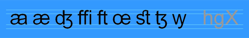
It’s hard to imagine the circumstances that would make a copywiter resort to a ligature. Apart perhaps from the aesc [alt-0230] – the conjoined vowel in encyclopædia. Since the spelling of encyclopædia has long since moved on through encyclopaedia to encyclopedia (Encyclopædia Britannica excluded – see above), resurrecting the aesc risks making you look hopelessly affected or out of touch.
For all other ligatures, the decision to use one comes at the design stage. You could stick your neck out by suggesting a ligature when you spot some awkward spacing in a layout. But you’re a mere writer with zero visual skills, so the design team will ignore you.
Find your ligatures and diphthongs
- Alphabetical ligature list: No easy alt-code lists. The best (Unicode or cut and paste) is from Wikipedia.
- Words you can spell with typographical diphthongs. Keen to show off by spelling Ægypt and gonorrhœa like a Victorian schoolmaster? This is the 200-word Wikipedia list for you.
Miscellaneous symbols and pictograms
This is the oddball stuff – the toy box of stars, arrows, signs, and ornaments – left over after sorting out the regular letters and characters. A few are vital, such as the legalistic warning symbols, © [alt-0169], ® [alt-0174], and ™ [alt-8482]; some are ancient typographical relics (❧ [alt-10087], ☞ [alt-9758], ¶ [alt-0182]); most are gimmicky, clipart-like characters (✌, ⚒,, ✈, ♥, ⚖ ) that have no place in proper writing. And there are zillions of them.
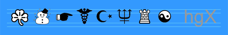
Sure, you might one day need to enliven your work with a symbol for the loos, a wheelchair, or an aircraft, but that device probably belongs somewhere else on the page, not within running text. Much better to leave the symbols and pictograms to your designer.
Find your symbols, ornaments, and dingbats
- Scroll-through list of dingbats. The Toptal list is as good as any. The images are clear, which is a huge help. Bear in mind that what turns up on your screen in your typeface might be a poor representation of what you see on Toptal.
- The full works: Got a day or two to spare? Then you could have a go at scrolling through 512 pages of Unicode characters at the Graphemica site.
Brilliant books on typography
Everything you need is online somewhere, but spread so thinly you never get to see how it all fits together. That’s what a decent book does. And these are the best two on typography. Both name and show all the weird and wonderful characters that make text such a delightful form of expression.
Please support your nearest independent bookshop by buying locally, not from Amazon.
The Elements of Typographic Style by Robert Bringhurst
Hartley & Marks, 2001
ISBN 0-88179-133-4 (cloth)
ISBN 0-88179-132-6 (pbk)
Bringhurst’s masterwork is a thing of beauty. His homage to the subject he loves feels good in the hand and delights the eye. You know that he’s thought about the position, layout, and presentation of every single character.
The Typographic Desk Reference by Theodore Rosendorf
Oak Knoll Press, 2009
ISBN 978-1-58456-231-3
A smaller and handier book, but not nearly as stylish. Rosendorf gives you all the characters (together with their Unicode) and an easy glossary of the terms. Flick through to find your character, then tap in the Unicode.
Printing and typography terms
Typographical definitions are a minefield of confusion, contradictions, and overlapping meanings. Every dictionary of print or typography offers its own version. So here’s a quick summary to help you out. Or, more likely, my invitation to be shot down by enthusiasts with their own idiosyncratic interpretations. Comments box below at the foot of the page.
Accent: A variation in letter pronunciation indicated by the addition of a diacritical mark. The accent is the sound, the diacritic is the symbol. In everyday use, accent is the word people use to describe a diacritic that changes pronunciation. But not all diacritics do change pronunciation.
Analphabetic: Any character or symbol that’s related to type and language, but is not part of the alphabet.
Character: Any letter, ligature, number, symbol, or device that acts as a single typographical unit. Same thing as a glyph – or at least it is in this blog.
Diacritic / Diacritical mark: A mark across, attached to, or next to a letter. Sometimes the mark indicates a variation in pronunciation (when it’s often known as an accent); sometimes it creates an entirely new character or performs some other lexical function.
Digraph: A single typographical unit composed of two characters that are neither joined nor touching. A digraph is a type of ligature.
Dingbat / Ornament: Two terms that are tricky to nail down. Generally a non-alphanumeric or non-typographic character that’s purely decorative. Sometimes dingbats are a specific group; sometimes ornaments are characters that create rules and other decorative devices. A dingbat is also a game and a term of abuse.
Diphthong: A single vowel that involves two sounds. Two particular diphthongs – better known as typographical diphthongs – have a special place in typography. They consist of pairs of conjoined vowels that have long functioned as a single character. They are the æ in Mediæval, and encyclopædia. and the œ in manœuvre and onomatopœia. A typographical diphthong is a type of ligature.
Face / Typeface: Type comes from the Greek typos, meaning the impression or effect of a blow – the imprint of a metal letter. So a typeface is literally the face or look of that imprint. In modern times, typeface has become the term to describe a family of related type styles. In general it refers to a set of characters of different sizes or weights designed or styled to work together as a single harmonious entity. The definitions vary. Some include absolutely all variations of a named type; others exclude certain styles such as italic or condensed. The term is often used interchangeably with font. That’s not surprising because people tend to use both to describe the visual effect of a piece of type, not a technical aspect.
Font / Fount: Term from the days of metal type that doesn’t have a neat modern equivalent. Traditionally a font was everything in a pair (upper and lower) of type cases – a complete set of characters and spaces of the same size and weight. In modern usage the terms font and typeface tend to be interchangeable. Some designers like to draw a distinction between the two, but few can agree on what that distinction is. They’re fighting a losing battle.
Glyph: Any letter, symbol, or character that can be typeset.
Homoglyph: One of a pair (or maybe more) of characters that look similar, but have different typographic functions. Examples are the number 0 and a capital O, and the thorn, Þ, of old English Þe (the), misrepresented in modern times as a Y, as in Ye [Olde Shoppe].
Ligature: A single character composed of two or three joined or tightly spaced letters. When the components of the ligature do not touch, they’re known as a digraph. The ligature looks more typographically pleasing than the component letters would look if they overlapped or were set with normal spacing. Some ligatures are historical vowel pairs (known as typographical diphthongs) that have long functioned as a single character.
Logogram: A single character or symbol that represents a concept. Examples are ©, 2, and ∞.
Pi character: Term from the days of metal type for any of the special characters not usually included in a font. Printers took their pi characters from somewhere else.
Pictogram: A character that conveys a simple (and usually universal) visual message. Often used in signs and instructions.
Sort: Term from the days of metal type for the physical piece of type that prints a particular character within a font. Each of the trays within a case of type contains its own unique set of identical sorts.
Special character / Ancillary character: Any non-alphanumeric or non-typographic character that’s not part of a traditional font.
Synoglyph: One of a pair (or maybe more) of characters that look different, but mean the same thing. An example is the pound sterling symbol, £, and the letter l for librae, as in librae, solidi, denarii (lsd = pounds, shillings, and pence).
Unicode, ASCII, and alt-codes
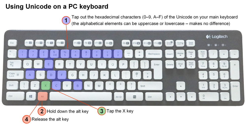
In a digital world we’re dependent on code. For typographical characters that’s Unicode, the international standard that covers the letters and symbols of the world’s writing systems. If a character has a Unicode, you can work with it – or at least a techie can. What you can produce with your keyboard in Word on your available typefaces (see Unicode instructions below) may well be less. The latest Unicode standard (version 13.0 – March 2020) defines more than 140,000 characters out of a possible set of roughly 1.1 million. The first three thousand or so are the characters in MS Word’s insert-symbol option. Most of the Unicodes you’re likely to encounter consist of four hexadecimal characters. Some have five or six characters.
- 512 pages of Unicode characters: Browse them in hexadecimal numerical order. Click any character for a big image and all supporting data (Graphemica.com).
ASCII, the American Standard Code for Information Interchange, originally defined a much smaller set of 128 alphanumeric characters based on the English alphabet. Only 95 of them were printable. An extended set of ASCII codes doubled up to 256 characters. Good enough for most people, but hopelessly limiting for anyone who’s read this far down this post.
- ASCII table: A page each for the basic and extended ASCII codes with their alt-codes and Unicode (ScienceBuddies.org).
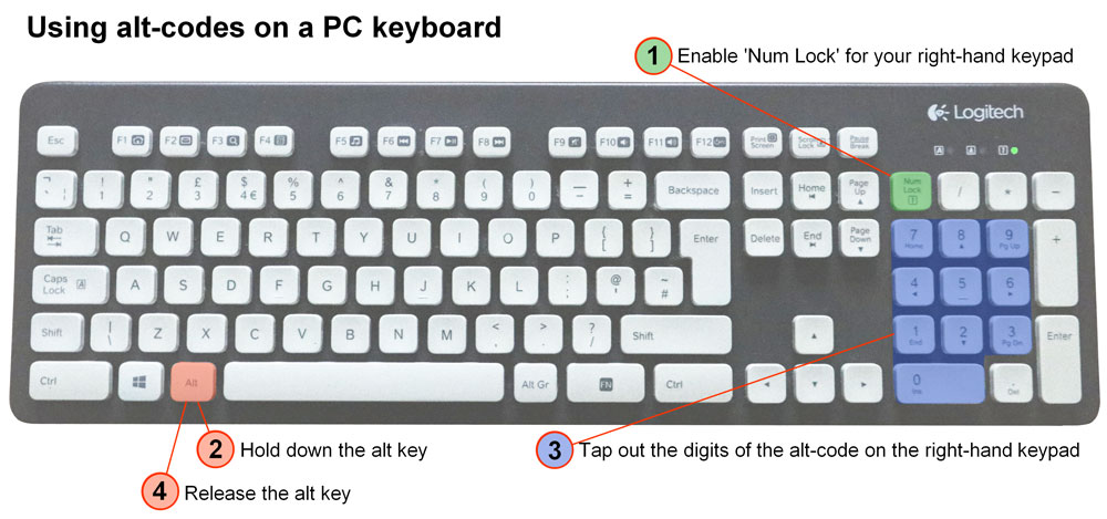
Alt-codes enable a shedload of liberating, world’s-your-oyster keystrokes for PC users. If you can find an alt-code for the character you want, there’s a good chance you can reproduce it with your own keyboard. Alt-codes produce all the ASCII characters and a huge swathe of additional Unicode characters. Sorry, absolutely no idea what you need if you’re a Mac user. (If anyone wants to provide some Mac help, I’ll happily incorporate it with a credit and a backlink.)
- 376 alt-codes: Easy-to-use list (Alt-Codes.net).
- 512 alt-codes: Bigger list (AltCodeUnicode.com).
Alt-codes and Unicode on a PC keyboard
See instructions in the images below.
- A couple of weird alt-code glitches are worth mentioning. Some common characters have two alt-codes. Also, the leading zero on some four-digit alt-codes is optional. On most it seems to be obligatory. And on a few, dropping the leading zero generates a completely different character.
- Some Unicode characters consist of two components, each with its own hexadecimal code. Tap out the first component (hex followed by alt-X) then the second (hex followed by alt-X). The two elements magically come together to create a single character.
- Apparently there’s an even easier easier way to tap out Unicodes, but it involves altering your computer registry which is way outside my comfort zone.
Warning: a confusing variety of special characters
Are a circumflex and a caret the same thing?
A LinkedIn thread that involved the character string ^p (a caret and a lowercase p) prompted me to write this post. When the poster said they had to look up the name for the upward-pointing arrow head (the caret [alt-94]), someone else said it was also a circumflex accent [alt-0136]. Yes, they look similar, but they’re not the same. In fact there’s a whole string of upward-pointing arrow heads, each with its own name and typographical role.
More characters than you can imagine
Even something as simple as a dash or hyphen gives you enough options to make your head spin. These are just a few of them.
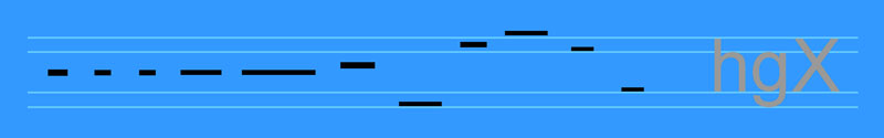
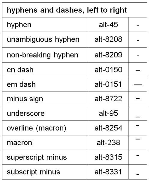
The lesson is that the first character you come across may not be the one you want. Even if it looks similar, it may not sit right on your line of type. Take your time. Use the links above to find the character that does the job that printers, typographers, linguists, phoneticists, mathematicians, scientists, or coders intended it to do.

